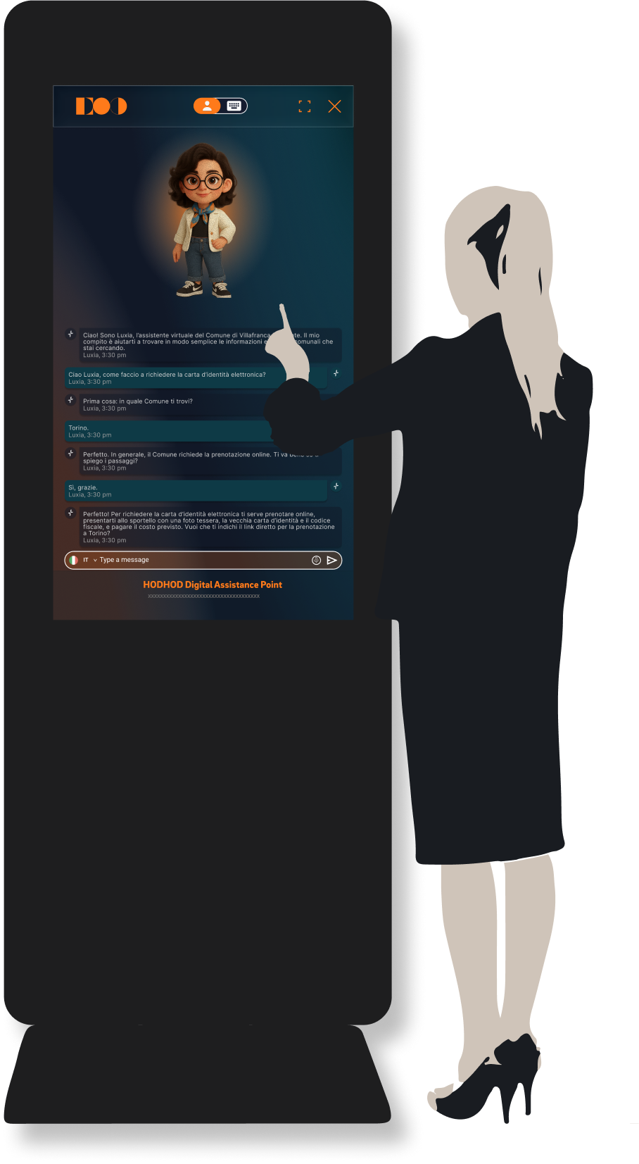
CASE STUDY

Civic AI Kiosk Assistant

An accessible public-service kiosk experience designed from idle screen to voice-and-text assistance with clear touch controls and readable interaction patterns.

RoleProduct Designer
FocusCivic AI UX
ToolsFigma
Civic kiosk assistant concept

Project Context

Civic support for real-world public touchpoints

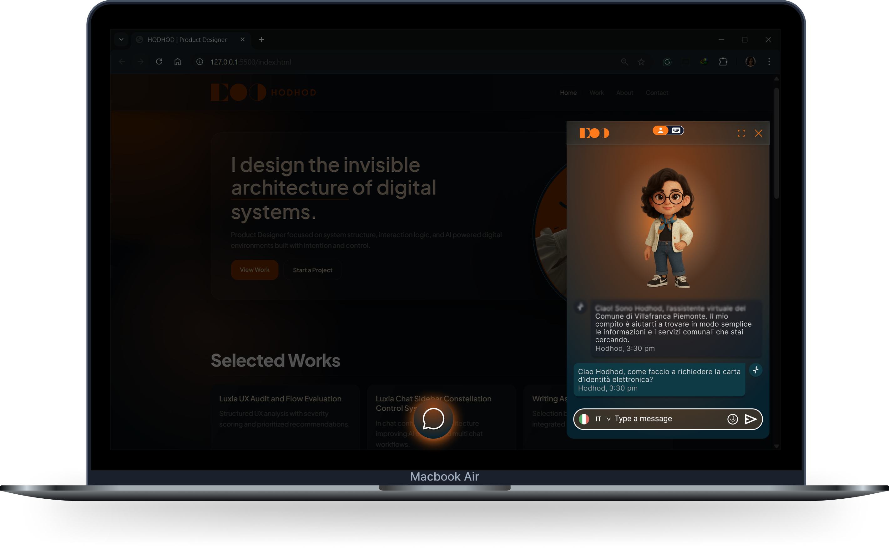
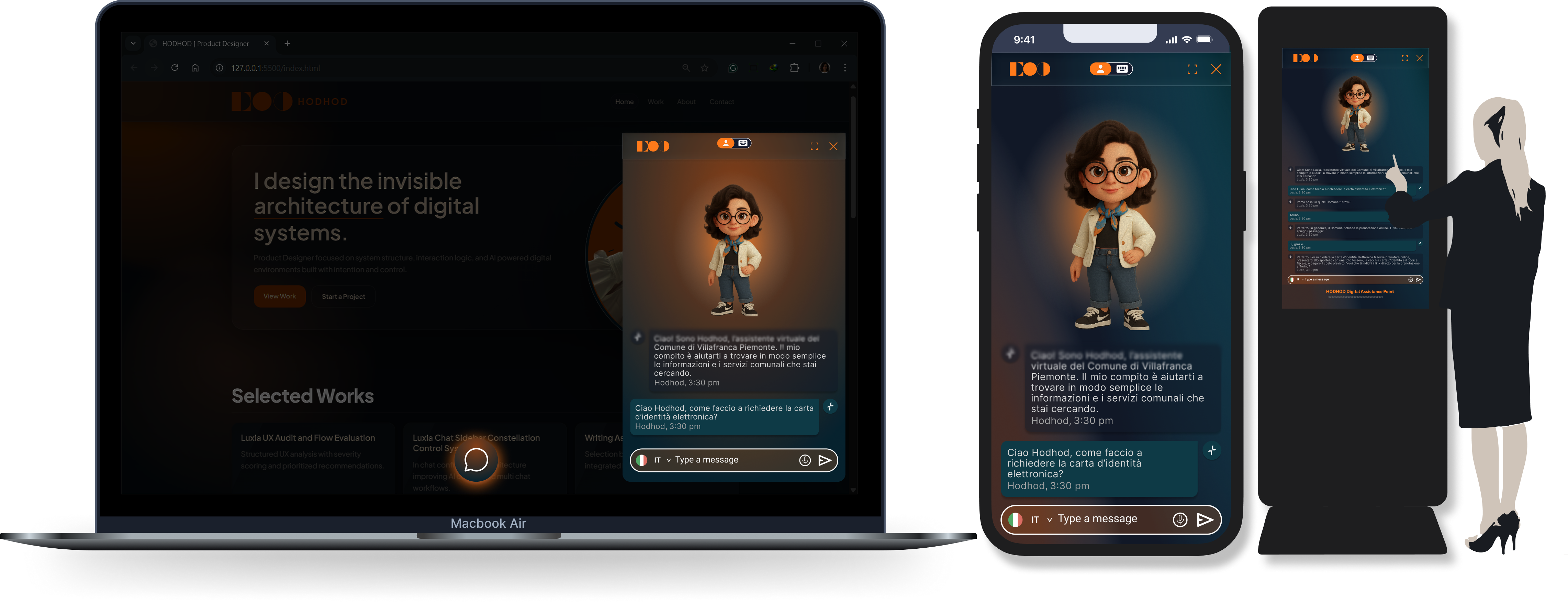
This assistant was designed for municipal spaces where citizens seek fast, practical information. The interface had to be inclusive, easy to start, and readable for mixed age groups and digital literacy levels.
The UX Challenge

Simple interactions for a broad audience

  • Create a clear screensaver state that invites interaction
  • Define a touch-to-start flow with no ambiguity
  • Support voice and text in one coherent journey
  • Keep fixed controls reachable in every state
  • Preserve accessibility and readability in a standing setup

My Role

From entry behavior to conversation clarity

I designed the full kiosk interaction arc, from attract state to in-session guidance. I focused on low-friction task completion, fixed reachable controls, and readable voice-and-text interaction for everyday public use.

Interaction Model / Core Flow

A short public-service journey

1. Signal readiness

The idle state clearly invites interaction.

2. Start in one tap

A single touch begins the session with immediate response.

3. Let people choose voice or text

Both modes are available immediately with no deep menu path.

4. Keep controls and next actions explicit

A fixed action zone stays reachable while responses keep next steps clear.

5. Reset for the next user

The assistant returns cleanly to start state.

Civic assistant flow and touch-to-start sequence concept

Key UX Decisions

Clarity before feature depth

Voice + text clarity

Voice and text remain distinct but follow one predictable interaction model.

Readable content blocks

Used short response chunks and stable typographic hierarchy.

Public-service tone

Microcopy was aligned with civic communication standards.

Start-state clarity

Screensaver-to-active transition behavior was made explicit and high-contrast.

Accessibility baseline

Touch targets, spacing, contrast, and fixed reachable controls were tuned for inclusive use.

Design System / Interface Logic

Civic branding with robust interaction rules

  • Adapted municipal branding into existing assistant components
  • Defined reusable structures for welcome, chat, and guidance screens
  • Applied consistent spacing and typographic rhythm for readability
  • Standardized state behavior for idle, active, and reset conditions
  • Kept interaction language consistent across service categories
Civic UI adaptation and component state concept
Focus area: civic clarity and inclusive interaction

Final Solution

A civic assistant that feels understandable from first touch

The final kiosk flow combines a clear start state, approachable text interaction, and practical public-service guidance in a stable interface model.

Citizen interactions became easier to start, follow, and finish.

Outcome

More approachable and easier to maintain

The interface reduced hesitation at the kiosk and improved completion of common service requests.